
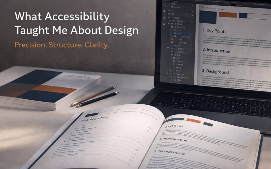
When UC Berkeley’s Possibility Lab came to 11:11 Designs with a project unlike anything I’d taken on before, I said yes before I fully understood what I was agreeing to. Twelve academic policy reports. A three-month turnaround. A publishing timeline that was already in motion.
What I didn’t know yet was that this project would teach me something I hadn’t expected to learn — that designing for accessibility doesn’t just open your work up to more people. It makes the work itself fundamentally better.
The Project: Twelve Reports, Three Months, No Shortcuts
UC Berkeley’s Possibility Lab is a research initiative dedicated to generating policy solutions that expand opportunity and address inequality. The work they publish matters — it reaches policymakers, academics, advocates, and communities who use research to drive real change. The documents have to be precise, credible, and professional. They have to look and feel like the serious, rigorous work they represent.
Over the course of three months, I designed and produced twelve academic reports covering a range of policy subjects. Each report required not just visual design and layout, but the kind of deep editorial attention that turns a dense body of research into something readable, navigable, and compelling. Twelve documents. Dozens of revisions. One very full calendar.
And somewhere in the middle of all of it — while a cover concept I’d spent significant time developing was scrapped entirely and rethought from the ground up — I was also learning something new: how to build documents that meet ADA accessibility standards.
The Pivot Nobody Plans For
Let’s talk about that cover for a moment, because it’s the kind of thing that doesn’t make it into polished case studies but absolutely defines what a project actually is.
Midway through production — with reports already in various stages of completion — the entire cover concept was reconsidered. Not tweaked. Not refined. Rethought. A new direction, a new visual language, a new system that then had to be applied consistently across all twelve documents, some of which were already deep into layout.
This is the reality of complex, multi-deliverable projects: the ground can shift beneath you, and your job is to absorb the change without letting it disrupt the quality of the output. At 11:11, we’ve built our practice around exactly this kind of agility — the ability to hold a creative vision loosely enough to let it evolve, while holding the standards tightly enough that the final product never shows the seams.
The reports turned out beautifully. The new cover direction was the right call. And we met the deadline.
What ADA Taught Me
I’ll be direct: going into this project, accessibility compliance felt like a technical obligation — a checklist to get through in order to meet the requirements of an institutional client. I had a working understanding of accessible design principles, but producing twelve documents to full ADA standards pushed me into territory I hadn’t occupied before.
What I found there surprised me.
Accessible Links Are Just Good Links
ADA requirements for hyperlinks mean that every URL must be described meaningfully — not displayed as a raw string of characters, but labeled with clear, descriptive anchor text that tells the reader exactly where the link leads and why it matters. For a screen reader, this is essential. For anyone navigating a dense academic document, it turns out, it’s also just better.
The discipline of writing accurate, descriptive link text forced me to look at every URL in every report with fresh eyes. That process caught errors — broken links, outdated sources, inconsistent citations — that might otherwise have slipped through. Accessibility requirements didn’t just make the documents more usable for people with disabilities. They made the documents more accurate for everyone.
Reading Order Is Information Architecture
When you design a document visually, you’re making assumptions about how a reader’s eye will move through the page. ADA-compliant documents require that the underlying reading order — the sequence in which a screen reader or assistive technology processes the content — matches the logical flow of the information.
Getting that right meant thinking carefully about the architecture of each report: what comes first, what follows, how sections relate to each other, where the reader needs context before they can absorb a finding. It’s the kind of structural thinking that good editors do instinctively. Building it into the design process made every report clearer, more coherent, and better organized — not just for readers using assistive technology, but for every reader.
Headings That Mean Something
Proper heading hierarchy — H1 for the document title, H2 for major sections, H3 for subsections, applied consistently and semantically — is a foundational ADA requirement. It’s also, as I was reminded on this project, the key to an effortless table of contents.
When headings are applied correctly, generating a ToC is not a manual, error-prone process. It’s automatic, accurate, and self-updating. Every one of the twelve Possibility Lab reports has a clean, correctly structured table of contents — because accessibility standards required the kind of heading discipline that makes a ToC not just possible but easy.
The Bigger Lesson: Constraints Are a Design Tool
There’s a principle in creative work that constraints produce better outcomes than unlimited freedom. Deadlines focus effort. Brand guidelines channel creativity. Budget limitations sharpen priorities.
ADA accessibility requirements are constraints. But they’re constraints that encode human insight — decades of understanding about how people actually read, navigate, process, and use documents. Designing to those standards doesn’t limit what a document can be. It raises the floor for what every document should be.
The twelve Possibility Lab reports are among the most carefully constructed documents I’ve produced. Not despite the accessibility requirements, but in part because of them. Every link is intentional. Every section flows logically from the one before it. Every heading earns its place. The covers — the final covers, after the pivot — are clean, authoritative, and consistent across the full series.
I came into this project thinking accessibility was something I was doing for a certain kind of reader. I left it understanding that accessibility is something you do for the work itself.
What This Means for Your Project
If you’re commissioning reports, white papers, policy documents, or any long-form content that needs to reach a broad audience — including audiences who rely on assistive technology — accessibility isn’t an add-on. It’s a design decision that touches every layer of the document, from the structure of the headings to the language of every link.
At 11:11 Designs, we now bring that lens to every document project we take on. Not because every client requires ADA compliance, but because the habits it builds — precision, clarity, structural integrity, attention to detail — make every document better.
Your research deserves to reach every reader who needs it. Let’s make sure it does.
—–
11:11 Designs is a San Francisco-based studio specializing in websites, branding, and digital storytelling. We work with founders, institutions, and organizations who believe that design is how you make your story seen — and felt.